What to Expect When You Work With Tilden
Investing in creative work can feel speculative and nerve-wracking, especially when you don’t know the exact outcome of a project going into it.
Our process is designed for success and collaboration every step of the way. We start with big-picture thinking through strategy and discovery, then gradually narrow in on the right solution with your input at every turn.
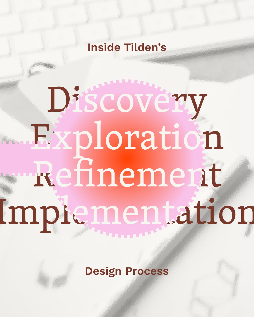
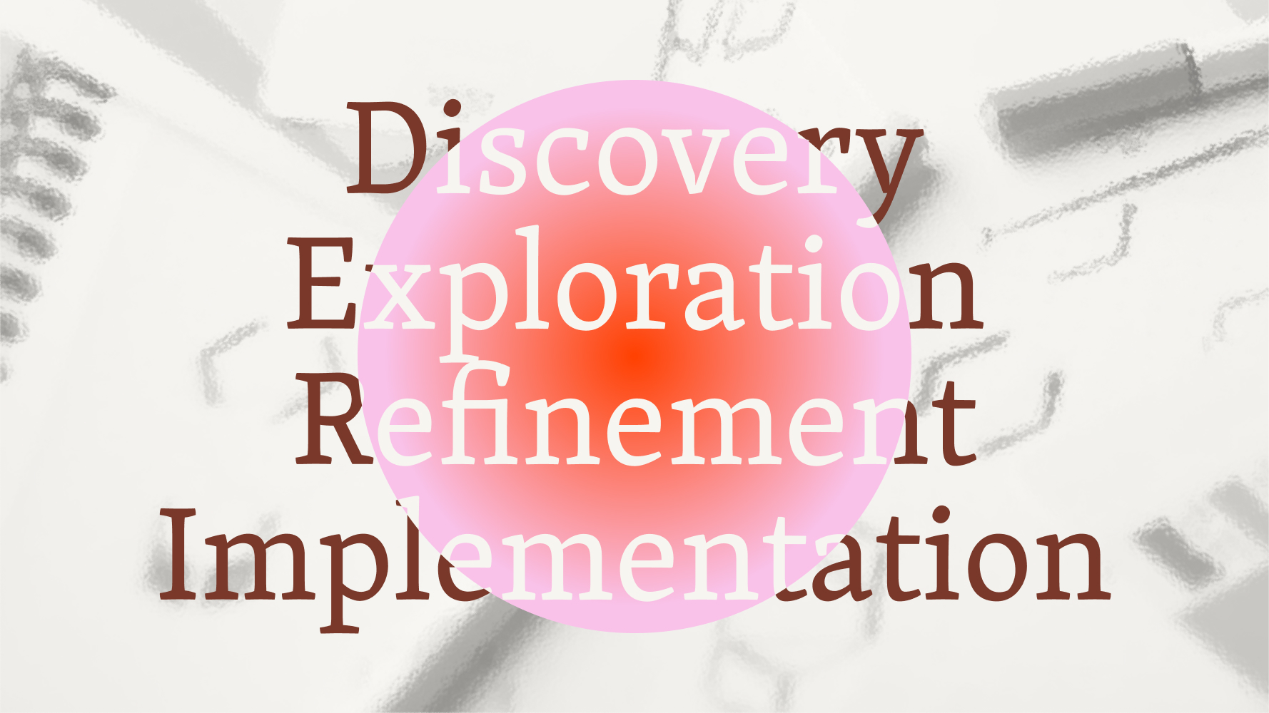
Four Steps for Success
Every project we take on follows the same core approach. Our process moves through four phases:
- Discovery
- Exploration
- Refinement
- Implementation
Each phase ends with opportunities for feedback or redirection so we’re always moving forward together.
This structure gives projects momentum without feeling like you’re on a conveyor belt. Strategy leads, design follows, and each phase builds intentionally on the one before it.
Phase 1: Discovery
We start each project with a solid foundation of strategy work. Discovery, positioning, and competitive audits help us understand where your brand fits, where it can stand apart, and what it needs to succeed.
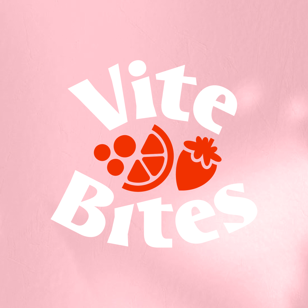
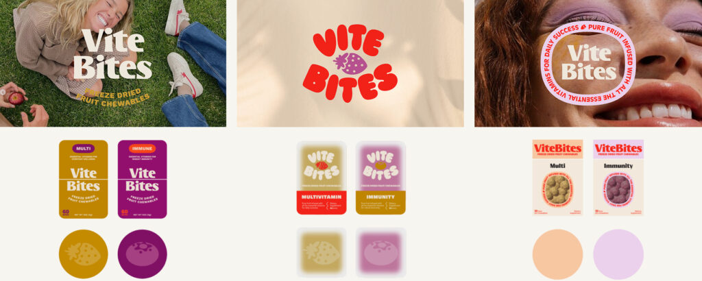
In Practice for ViteBites
We conducted competitive and visual research, then developed three distinct mood boards to define a playful, bold, ingredient-forward direction.
Phase 2: Exploration
We then explore a wide range of possibilities for each project. We review concepts together, discuss what’s resonating, and use your feedback to choose a direction to move forward with.
In Practice for ViteBites
We explored multiple brand directions, each with its own logo, type system, color palette, and early packaging layouts.
Phase 3: Refinement
We refine the selected direction, incorporating feedback and dialing in details until everything feels just right.
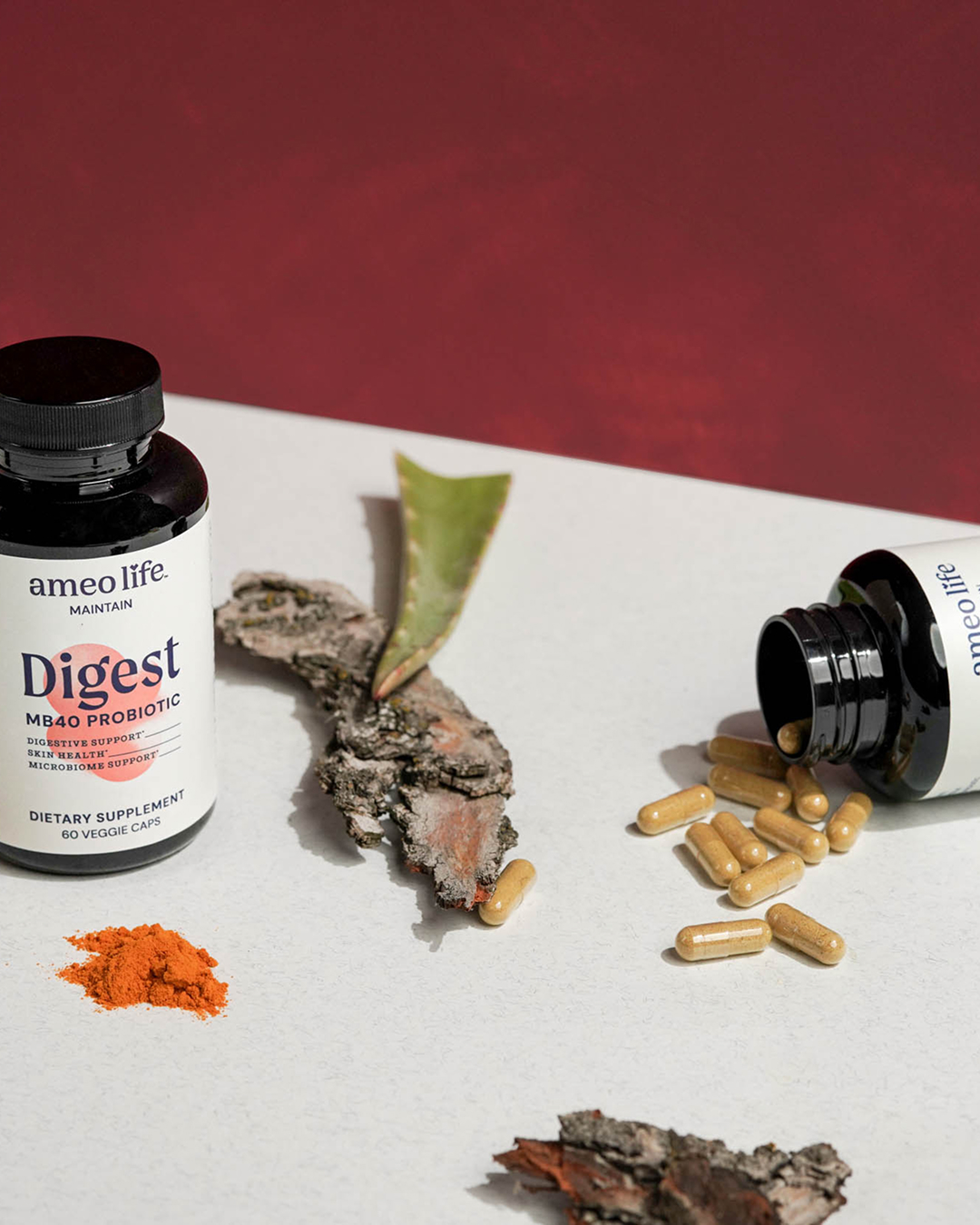
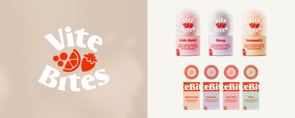
In Practice for ViteBites
We landed on a logo, typography, and flavor-based color system that felt bold and innovative for the space.
Phase 4: Implementation
Once everything is finalized and approved, we bring the brand to life across real-world touchpoints.
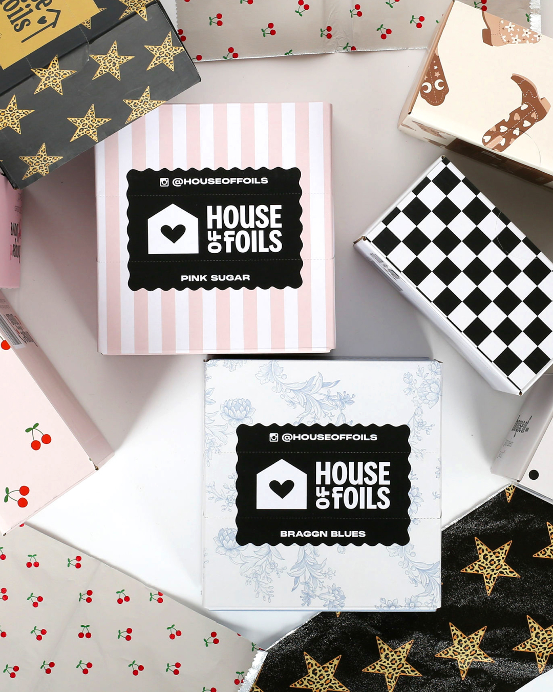
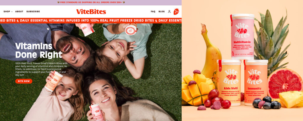
In Practice for ViteBites
We produced final packaging files, lifestyle photography, a conversion-focused Shopify site, supporting marketing assets, and comprehensive brand guidelines.
What clients are often surprised by
Clients often tell us they’re surprised by how collaborative the process feels. Early alignment makes later decisions easier and more fun. Instead of second-guessing every detail, teams move forward with confidence and excitement.
What to expect overall
Working with Tilden means a clear process, lots of opportunities for feedback, and design decisions rooted in strategy.
If you’re considering a branding project and want to understand what this process could look like for your business, we’re always happy to talk it through.